Wednesday, 8 June 2016

Black Swan

Black Swan
Materials:  Clay and acrylic paint

For this assignment, I decided to create a sculpture of a swan.  This swan is not an ordinary swan, but it is a black swan.  Using sculpting clay, I first created the body of the swan and then rolled the clay to create the neck and head.  Then taking small pieces of the clay, I rolled the pieces to create the feathers of the swan.  

I was inspired to create this sculpture from the movie Black Swan.  The black swan represents the corruption of a persons mind.  Even though the film is about a woman's alter-ego, I decided to create my sculpture based on people's perception of themselves.  I believe that everyone starts their life as a "white swan", someone/something that is beautiful and pure.  As time progresses in a persons life, effects of media and society may corrupt their minds.  As this happens, they turn into a black swan.  They start to hate themselves, and begin to turn into something that will eventually destroy themselves.  People need to realize that they are powerful enough to overcome the effects of society and stay their pure and beautiful selves.  

"To be yourself in a world that is constantly trying to make you something else is the greatest accomplishment." - Ralph Waldo Emerson

-Yours Truly

Wednesday, 1 June 2016

Fashionista

Fashionista 
Materials:  Pencil crayon on cartridge paper

Using a hard pencil, I drew a croquis fashion drawing.  I then added a dress to the woman in the drawing.  Using a purple pencil crayon, I shaded different areas of the dress to create lighter parts of the dress and shadows on other parts.  Using a black pencil crayon, I went on top of the darker areas and shadows of the purple and added more darker areas creating the appearance of depth throughout the dress. I also left some very white areas on the dress to create a highlight.  I decided not to put a face on the croquis drawing because I believe that a face would take away from the drawing and the dress.
I was inspired to create this dress as I find designing red carpet dresses very interesting.  It has always been a dream of mine to walk down a red carpet wearing an extremely nice gown.  I figured that this would most likely never happen, and therefore, I decided that I would design a dress that I would want to wear if I were to walk down a red carpet.  

I know that you should never give up on your dreams, so I will never stop dreaming and trying to live out my dreams.  I will continue to draw and paint, and hopefully, one day be famous enough to get the chance to walk down a red carpet.  

"Reach for the moon and if you miss, you'll land among the starts." - Unknown

- Yours Truly 

Pretty in Red

Pretty in Red
Materials:  Acrylic paint on canvas

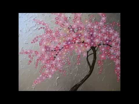
For this painting, I first used a painting knife to spread silver acrylic paint on the entire background.  Once this had dried, it created a 3-dimensional texture.  Using different acrylic paint, I then painted black branches of a tree and red flowers on top of the branches.  

I decided to title this painting Pretty in Red because it is a painting of a cherry blossom tree.  Usually, cherry blossom flowers are more of a pink colour rather than red.  I feel that red cherry blossoms have a more modern appearance and would match better if it was to be displayed in a home.  Because I am interested in interior design, I like paintings that would fit well when displayed throughout homes.  Even though cherry blossoms are usually pink, I believe that they also look pretty when painted using red.  

To create this painting, I was inspired by another painting of a cherry blossom tree.  Both my painting and the painting that inspired me have a textured background and include many flowers.  I wanted my painting to be different from this one, so instead of using brown for the branches of the tree, I used black.  Also, instead of using pink for the flowers, I used red.

Today, people believe that in order to fit in with the rest of society, they need to be just like everyone else.  They need to wear the same thing, have the same body and facial features, and act the same.  However, people need to realize that they are their own person.  It is good to be different from other people.  Accept who you are because everyone was created the way they were, for a reason.  

-Yours Truly

Sunday, 29 May 2016

Care Free

Care Free

Materials:  Pencil, marker on cartridge paper

Using a hard pencil, I drew an image of a girl with her hair flowing in the wind.  Around the girls hair are butterfly's .  This image was a candidate for a mural, to be placed on one of the outside walls of the school I attend.  The assignment was to create a piece showing a girl with flowing hair, and incorporate butterfly's in the piece.  This is exactly what I tried to create.  

In my drawing I decided to leave the hair of the girl black and white, while I placed a pop of colour in the image throughout the girl's shirt.  For the butterfly's, I left the wings of the butterfly's an outline and also matched the colour of the girls shirt with the center colour of the butterfl'y.  

I wanted my drawing to appear more realistic which is why I placed less colour in my drawing.   I believe that my drawing shows innocence in a person and how the stress in a persons life may not affect them.  It is possible for a person to be carefree in the world.  With so much to worry about in society, such as work, school, and debts that may come from school or eveyrday life, it is important to remember to take a step back from life, and take a deep breath and just focus on breathing.  Live in the moment.  Do not think about what is going to happen tomorrow or what happened in the past. Let your hair down and feel the wind flowing through it.

This image also depicts Mother Nature.  With the butterfly's around the girls hair, and the innocence in the girls face, I believe that the girl in the image does represent Mother Nature.  This is useful for the outdoor classroom because there will be many plants that attract butterfly's and the outdoor classroom will also be encouraging students to love the nature that surrounds them.

-Yours Truly 

Sunday, 22 May 2016

4 Times the Drama

4 Times the Drama

Materials:  Watercolour paint on canvas

Using a soft pencil, I drew lips on a blank sheet of paper and then traced the image on tracing paper.  I then took the tracing paper and transferred the image of lips onto four other canvas'.  Then, using a wet on wet technique, I painted the images of lips using various colours and then filled the center of the lips using black paint.


I was inspired to complete this painting as I came across Andy Warhol's painting of Marilyn Monroe.  I liked the idea of using repetition for a painting.  I also like the idea of using different, bright colours to create the painting.

I decided to title this painting 4 Times the Drama because peoples lips are what speak gossip about others.  Some people find it difficult to speak while other people find it difficult to be quiet.Speaking is a form of communication to communicate with other people.  Gossiping is what may cause drama sometimes, especially throughout high school.  People may think that it is cool to speak falsely about others, however, it is not.  It just causes problems with people and may affect a persons mind negatively.
  
- Yours Truly

Drip Drop

Drip Drop

Materials:  Water colour paint on canvas

To create this painting, I first drew the skyline of New York, using a hard pencil, on canvas.  On top of the pencil, I used a wet on wet technique, where I placed water on the canvas and then placed water colour paint on top of the water.  I then mixed the colours together to create a continuous flow of the colours throughout the painting.  As the paint on the canvas was still wet, I held my canvas upright, allowing the paint and the colours to drip down the canvas.

I was inspired to create this painting as I came across this painting of the skyline of New York.  I liked the different colours that were used throughout the painting and I felt that it helped to show the beauty of the city.  New York is one of my favourite places to see and to shop in.  I like the excitement of the city and I feel that anything can happen in the city.

I feel that using a multitude of colours throughout the painting allows me to express myself and my emotions.  The different colours show the diversity throughout the city.  The drips of the paint also show how at times, there is chaos in the city that can ruin the city.  However, after all of the negative impacts on the city, you must find beauty in the madness.

- Yours Truly

Lazy Sundays

Lazy Sundays

Materials:  Acrylic paint on canvas

To create this piece, I first drew the image or flowers on a canvas using a hard pencil.  This created a light sketch of the flowers so it was easy to paint over.  Using green acrylic paint, I used a wet on wet technique for the background where I placed water on the canvas and then dripped the green paint throughout the water as the colour spread, creating a water colour affect.  Once I painted the background, I used red and white paint and various shades of pink paint to paint the flowers.  I placed red paint in the center of the flowers, white on the outer egdes, and pink in the middle of the flowers and dragged the colours together.  Then, I finished the painting by painting the stems using dark brown and light brown paint.  This helped to create a more realistic look to the painting.  

As inspiration for this painting, I looked at this painting of flowers.  I liked the idea of having flowers painted across an entire canvas.  I also liked the colours in this painting but I felt that they needed to be more vibrant instead of soft, which is why I recreated this painting. 

I decided to title this painting Lazy Sundays.  For me, Sundays are a day of relaxation and spending time with my family.  During the summer, my family and I would go out and search for new flowers to place outside, and around the house; this would usually happen on Sundays.  When I look at this painting, I feel relaxed and calm, almost as I am spending my day picking flowers on a Sunday.

I believe that now, people get so caught up in their everyday lives that they forget to stop and appreciate the life that they are living.  Hopefully, this painting will catch peoples attention and make them appreciate not only art that is created, but art that is created to help people release tension and stress that they may have.  It may help them to let go of whatever they are holding on to, take a breath, and appreciate life.    

"The trick is to enjoy life.  Don't wash away your days, waiting for better ones ahead." - Marjorie Pay Hinckley

- Yours Truly 

Sunday, 3 April 2016

Fashion Croquis

Fashion Croquis

Materials:  Pencil on cartridge paper

As two female models stood in front of me, I looked at them and drew one as I saw her.  This is a quick, live sketch of a model which is what considers it a croquis drawing.  Using various shades of pencils, consisting of 2B, 3B and 4B, I drew the model and shaded the image. Using the different pencils allowed me to create tones throughout the drawing, creating shadow and lightness in certain spots.  I also tried to recreate the same outfit that the models were wearing at that time.  

The first step for this drawing was to draw the figure of the model, creating the same stance.  After that, I added clothes on the figure.  I decided not to draw a face on the model because I feel that drawing a face takes away from the image of the actual figure and the clothes that the figure is wearing.  

"Fashion is art and you are the canvas." - Velvet Paper

- Yours Truly 


https://www.pinterest.com/pin/200691727119749350/

Tuesday, 29 March 2016

Beneath the Surface

Beneath the Surface

Materials:  Acrylic paint on reading novel paper

To create this piece, I first placed pieces of paper which I have ripped out from old novels, and glued them on top of a large sheet of paper.  Once the glue had dried, I painted the face of woman on top of the paper, using only black paint for the details of the face and blue and white paint for the eyes.  Using different tones and washes of the black paint, I was able to create the appearance of shadows on the face, making it appear more realistic. 

I decided to call this painting beneath the surface because the woman in the painting looks as if she is looking in the distance and is captivated by something which cannot be seen by the viewers.  I also decided to paint the entire face using black paint, while only the eye with blue paint because I believe that eyes are the windows to the soul; a lot can be seen through the eyes of a person.  It is a persons eyes which light up as they tell an intriguing story, that start to water when a person is emotional, and that never change as a person gets older.  I believe that beneath the eyes, there is always more beneath the surface of a person.  There are untold stories which want to be shared, but cannot; thoughts that are cramped up inside a mind waiting to find a way out.  Many people may think they may know a person well, however, they may not see the entire person inside and out.

The main goal of this piece was to captivate an audience and intrigue them into finding what is beneath the surface of this woman, and also make them wonder what the woman is looking at which cannot be seen.    

- Yours Truly 


Inspiration:  http://favim.com/image/2440144/

Sunday, 28 February 2016

Native American Art - Geometric Bird

Geometric Bird

Materials:  Acrylic paint on cartridge paper 

To create an art piece representing Native American Art I painted an image of a bird.  In the Native American culture, there are various symbols representing different things.  


I tried to recreate this image of Native American art which I found.  It is a very intricate drawing of a bird that has meaning to it.  The bird is believed to represent the physical form of a spirit helper and guide.  It is also believed that because of their ability to fly, birds are seen as messengers and bringers of change.  The birds of the feathers are used for spiritual and ritual uses. 


Within the bird, there are different geometric shapes that make the image of the bird appear to be slightly abstract.  This image of a bird does have meaning for Native Americans and I believe that it is important to understand the art of different cultures.  It is important to see the differences and similarities between the art of cultures, so people can find ways to connect with each other.  

- Yours Truly

https://www.pinterest.com/pin/397935317051618491/
http://www.warpaths2peacepipes.com/native-american-symbols/bird-symbols.htm

Art of Mexico - Flowers and Leaves

Flowers and Leaves

Materials:  Marker on paper

To create an art piece for the art of Mexico, I decided to draw patterns on paper using various markers.  All of the objects in the foreground of the drawing are flowers while the green background is supposed to be images of leaves.


I was inspired to create this drawing as I saw this Mexican art piece which includes images of trees with flowers and leaves falling off of it.  My art piece is more abstract since it is difficult to see what it is actually a drawing of.  However, I wanted to capture a similar feeling as this piece, and so I included flowers and leaves in my drawing.

- Yours Truly


https://www.pinterest.com/hofer77sandra/mexican-art/

Art of Africa - Peaceful Place

Peaceful Place

Materials:  Acrylic paint on paper

To represent an African art piece, I painted this image of a silhouette of a tree, placed in front of a sunset.  Using pencil, I first drew the outline of mountains in the background and the silhouette of a tree.  Then, using various colours consisting of red, brown and yellow, I created a wash with these colours to place in the background.  Once the background paint dried, I used black paint to paint the silhouettes.

I decided to title this painting "Peaceful Place" because as I look at this painting, it brings a sense of peace and calmness to me.  The sunset and the isolation of the scenery makes me feel calm as this place appears to be far from society.  It is far from wars, and far from anything bad happening in the world.  


I was inspired to create this painting as I came across this image of African Art.  This painting made me feel peaceful as I watched the sunset and the family in the foreground of the image, walking peacefully in the sunset.  

In my painting, I wanted viewers to have the same feelings that I did.  I wanted them to be able to picture themselves watching a sunset, as they are alone in a deserted area, away from society.  


- Yours Truly 


http://www.nairaland.com/124005/art-lovers-house-appreciate-african

Modern Canadian Art - Cherry Blossom

Cherry Blossom 

Materials:  Acrylic paint on cartridge paper

To create this painting, I first drew the outline of a tree, and then taking different tones of red paint, I blotted the paint throughout the background of the painting and then painted the tree brown. Once the paint for the background and the tree dried, I dotted white paint on the branches of the tree, and in the center of the white dots, added red to create the look of flower petals.

To create a painting based on modern Canadian art, I decided to paint a Cherry Blossom Tree. To me, this seems like a typical painting that would be hung throughout the homes of many people. It is a painting that many people would want to have to decorate a space.

I was inspired to create this painting as I came across another painting of a Cherry Blossom tree.  To me, this painting appears as if it is hung within a home as a decoration for the space.  I believe that modern Canadian art is any art that one would want to decorate a space with.  Also, because times are changing, modern Canadian art would be anything an artist would want to paint along with anything one believes is art.  People are becoming more accepting with different types of art, which is why art can be anything a person believes it to be.

-Yours Truly

http://vancouver.canadianlisted.com/art-antiques/original-canadian-modern-abstract-art-painting-cherry-blossom-200-west-vancouver-coquitlam_3094391.html

Surrealism - What we can See

What we can See


Materials:  Pencil and pencil crayon on cartridge paper

Surrealists focused on capturing their recurring thoughts or dreams in their art.  They also looked at capturing imagery found in nature, throughout their artwork, such as birds or insects.  

To capture surrealism in my art piece, I drew a picture of an eye with the world in the center.  Using various shades of pencils, consisting of 2B, 4B, and 6B, I drew and shaded the eye, and using pencil crayons, I coloured and shaded the world in the center of the eye. 

I placed an image of the world in the center of an eye because I wanted my image to give the message that everyone sees the world differently. My world may be different from someone elses world. This goes along with the quote "beauty is in the eye of the beholder."  What one person may see beautiful, another person may not see as beautiful.

I was inspired to create this drawing as I saw this image of an eye crying in an ocean.  I thought that the eye in the image was very captivating and I wanted to include it in my drawing.  I also feel as though the eyes are the windows to the soul.  As one person looks into someone elses eyes, they can see a lot.  For example, as a person may look into someones eyes, they can tell if a person is lying or telling the truth.  Also, when a person shows strong emotions such as happiness or sadness, they may start to cry.  

I believe that this drawing can captivate an audience and make them think of the deeper meaning behind it, which is that everyone sees the world differently.  

"Behind the most beautiful eyes, lay secrets deeper and darker than the mysterious seas."  - yld

- Yours Truly 

http://www.theartstory.org/movement-surrealism.htm
https://www.pinterest.com/seaskywind/surreal/
http://quotesgram.com/behind-these-eyes-quotes/    

OpArt - 3-Dimensional Shapes

3-Dimensional Shapes

Materials:  Fine-liner on cartridge paper

Op art focused on creating illusion and different perceptions.  Some people say that op art consists of "retinal tiltilations", while others say that it is a kind of abstract Pop Art.

To create an art piece showing op art, I drew this abstract piece.  Using a fine-liner pen, I drew a series of triangles across a paper and then filled in the triangles with curved lines.  

In this image, it appears as if the shapes are 3-dimensional.  The curved lines add depth in the drawing which create the optical illusions.  I was inspired to create this drawing as I came across this art piece of op art.  In this piece, it appears as if there are triangles coming out of the paper, when in reality, the shapes in the image are just flat.  

The main goal of my drawing was for viewers to feel as if they have been tricked into thinking that the shapes in the drawing were 3-dimensional.  

- Yours Truly

http://www.theartstory.org/movement-op-art.htm
https://www.pinterest.com/pin/160229699212684226/

Conceptual Art - Beautiful Dancer

Beautiful Dancer

Materials:  Fine liner on paper, rose petals 

Artists of this time did not focus on beauty and skill captured in the art.  They used a minimal amount of materials, as their art did not need to look like traditional art pieces.  

As a conceptual art piece, I decided to create a drawing that showed a ballerina dancing.  I first sketched the ballerina using a fine liner marker, and then placed rose petals in a formation that would allow viewers to visualize the ballerina wearing a dress.  

Ballerinas are beautiful dancers that move beautifully and swiftly. I wanted to add to their beauty by taking real rose petals, and created a dress on the ballerina.  


I was inspired to create this piece as I came across this image of a girl with a flower dress.  I feel that adding the flowers to the art piece adds to the beauty of the image because flowers are a part of nature that adds to the worlds beauty.  I feel that if flowers can add to the worlds beauty, then they can also add beauty to an art piece.  


"Look for beauty in ordinary things, and your world will become amazing."

- Yours Truly 


http://www.theartstory.org/movement-conceptual-art.htm
http://quotesgram.com/beautiful-amazing-love-quotes/
http://rebloggy.com/post/art-artwork-flower-rose-water-color-hydrangea-rose-petals-flower-petals-limz/86580459876

Post Modern Art - Marilyn So Blue

Marilyn So Blue 

Materials:  Acrylic paint on cartridge paper

To create an art piece of post modern art, I painted this image of Marilyn Monroe.  Marilyn Monroe is a very popular icon who has inspired people in the pop culture society.  Artist, Andy Warhol created many art pieces which contained images of Monroe.  Since she was a very popular icon, it would be easy for people to look at an image and know that it is Marilyn Monroe.  

To create this painting, I first drew the outline of Marilyn Monroe using pencil, and then I painted the inside silhouette using blue paint, then painted the background using orange paint.  I thought that since blue and orange are contrasting colours, this would help to make the figure of Marilyn Monroe stand out.  


As an inspiration for this art piece, I looked at one of Andy Warhol's famous paintings of Marilyn Monroe.  In this painting, he used multiple colours to create different images of Marilyn Monroe, making different parts of the face stand out throughout each image.


- Yours Truly 


http://www.thecultureconcept.com/circle/andy-warhol-pop-art-prince-king-of-peoples-perceptions

Modern Architecture - The Glass House

The Glass House


Materials:  Pencil crayon on paper

To create a design showing modern architecture, I drew this image of a modern house.  I believe that today, a lot of homes are incorporating more glass windows in the architecture of the home. Throughout my design, I chose to add large glass windows to the side and the front of the house.  I like homes that have a lot of day light, as well as light from the night, shining through the windows.   Windows can also help create the illusion that a space is bigger than it actually is.  I also added side panels on the house to balance with the glass windows; I did not want the house to only have glass walls. I also placed the home on top of wood because I like the appearance of wood rather than pavement or grass.  I think that wood looks cleaner and adds to the beauty of the home.

My inspiration for this design came from this image of a modern house which contains a mixture of glass balcony's, glass windows, and white panels that run along the sides of the house.  I thought that this design of the house looked clean, elegant and modern which is why I wanted to recreate it.

-Yours Truly


http://bonamanasuju.blog.com/2015/06/29/modern-architect-changing-the-landscape-of-the-field-of-architecture/

Photographs - Pretty Pink Flowers

Pretty Pink Flowers

Last summer, on a beautiful summer day, I noticed how pretty the flowers around me were.  I loved how each petal on the flower had an ombre effect where the colours on the petal changed from light to dark.  I decided to take a photograph of this pink flower which I saw.  I placed the flower in the photograph to the right of the photo, so it would allow a viewers eye to focus on the flower in the foreground, as well as the flowers in the background.  I also wanted to capture the green stems in the photograph so people would be able to see the entire flower rather than just one petal.

My inspiration for this photograph was how I was feeling at the time.  I was happy, going for a walk during the summer, enjoying my time.  The weather was very nice outside and I noticed all of the exquisite nature around me.  I wanted to capture the beauty of the nature and be able to show it to other people, so they could feel the warmth of the summertime temperatures, and visualize all of the flowers in nature growing.   


- Yours Truly 

Photorealism - Coke Cans

Coke Cans

Photorealism mixed together what is real and what is not real. For example, a photograph that was taken was based upon reality, however, there would be optical effects added to the photograph to create a blurred image or background. The artwork displayed popular consumer goods, fast food restaurants and mechanical toys, and would use colour and light together as one element.  

To create a photograph showing photorealism, I took a photograph of Coke cans with names on them.  Coke is a very popular consumer brand and now they have released Coke cans which are designed with consumers names on them.  This will encourage the growth of the company as many people will now start to buy more Coke products that have their names on them.  

I was inspired to take this photograph as I came across this photograph of Coke cans inside a plastic bag.  This photograph shows that someone has purchased these Coke cans, which makes it a consumer good.  At the time of photorealism, Coke was a very popular company, and now, it still is.  

I wanted to photograph Coke cans because I beleive that Coke will continue to be a very popular company, as when someone looks at a photograph with Coke cans, they can relate to the image because they have already tasted Coke.  

- Yours Truly 

http://www.theartstory.org/movement-photorealism.htm
http://www.ignant.de/2012/11/21/best-of-photorealism/

Minimalism - Connections

Connections

Materials:  Black marker on cartridge paper

Minimalists did not include the suggestion of metaphors in their art.  They wanted to focus on the placement of objects and on the physical space being occupied.  Viewers of the art were to experience qualities of weight, height, gravity and even the appearance of light.

In this art piece, I drew a telephone pole connecting telephone wires together.  Since minimalism does not use a lot of space when placing objects in an art piece, I wanted to place emphasis on the telephone pole on the left side of the paper.  By adding the telephone wires, viewers can follow the wires as they branch off into the unknown space.  

Today, many people are connected throughout the world with the use of advanced technology. Cell phones as well as social media make it easier for people to stay connected as they have easy access when communicating with others.  I wanted people to realize that even though we may be across the world, distant from seeing another person, there will always be a way to communicate with that person.  

I was inspired to create this drawing as I came across this image of two birds sitting upon a telephone wire.  The birds appear to be communicating with each other, and that is how I got the idea of a telephone pole, to show the connection between people. 

- Yours Truly 

http://www.theartstory.org/movement-minimalism.htm
https://anthonyuu.wordpress.com/2015/05/03/becoming-minimalist/

Saturday, 27 February 2016

Colour Field - Multiple Colours

Multiple Colours

Materials:  Acrylic paint on cartridge paper

Colour field tried to achieve form and composition.  The paintings were abstract and avoided the suggestion of a form standing out against a background.

Using painters tape, I placed tape on paper creating square and rectangular shapes across the paper, and then pained the shapes using colours which I thought would create unity; red, pink and brown.  

My painting is abstract, as it does not contain any form and does not suggest that anything stands out on top of a background.  I was inspired by this painting of colour field which also uses square and rectangular shapes.  The colours in this painting harmonize together to create unity in the painting, instead of making the painting just appear as squares on paper.  

- Yours Truly

http://www.theartstory.org/movement-color-field-painting.htm
http://en.artoffer.com/Art-postcard-dispatch/?imagenr=116946

Abstract Expressionism - Feeling Grey

Feeling Grey

Abstract expressionism focused on expressing individual freedom.  Abstract expressionists were influenced by style and would focus on the unconscious.

To create an art piece of abstract expressionism, I splattered paint across a canvas.  First, I painted a canvas black, and then I used different shades of grey, and white and black, and splattered it on the canvas.  There is no structure in this piece which makes is abstract expressionism.  As I was painting this, it made me feel relieved to release tension that was within me, as I hit brushes together, splattering the paint.  I was not really thinking about what I was doing at the time, and instead I was just enjoying my time while painting.

My inspiration for this piece was a painting by Jackson Pollock.  Using oil paint and canvas, Pollock splattered the paint across the canvas. Through this painting, you can visualize the painters emotions at the time, and how they were feeling.

Abstract expressionism is art that allows a painter to be free and to express themselves.  It is one of my favourite art periods, as there is no structure to follow while painting.  It allows me to express my anger when I am feeling mad about something, or release my unconscious thoughts.

- Yours Truly

http://www.theartstory.org/movement-abstract-expressionism.htm
https://www.khanacademy.org/humanities/art-1010/abstract-exp-nyschool/ny-school/a/the-impact-of-abstract-expressionism

Dadaism - Flawed

Flawed 


Materials:  Acrylic paint on cartridge paper

Dadaism art tried to make people question society, the thoughts of the artists and the purpose behind the art.

To create an art piece from the period of Dadaism, I painted rectangular shapes on cartridge paper and inside the rectangles, I drew other shapes to create the image of a face.  I decided to paint an abstract-looking face inside shapes because I wanted people to be able to connect with the painting.  When a person sees another person, they either make a connection with them or they do not.  As a person looks at my painting, they can question what the deeper meaning behind the painting is.  I decided to use different, bright colours to make certain parts of the painting stand out.  For example, I used yellow, which is a bright colour, to paint the eyes so that they stand out, and I used red, which is also a bright colour, to paint the lips.

My inspiration for this painting was this abstract painting of a woman.  There is a womans face that has no symmetry.  In my painting, there is also no symmetry.  To me, this represents that no person is perfect.  Everyone has flaws and everyone must learn to accepts their flaws.


Love yourself

- Yours Truly


http://www.theartstory.org/movement-dada.htm
http://www.playideas.com/25-picasso-inspired-art-projects-for-kids/

Suprematism - Crookedness

Crookedness


Materials:  Acrylic paint on cartridge paper

Suprematism art focused on abstract art and flat shapes.  It emphasized the surface texture of paint on canvas.  The idea was for people to look at art in different and new ways.  

Using painters tape, I created different rectangular shapes on paper, that slanted in different directions.  Then, using acrylic paint, I filled in the rectangular space with different colours to create the shapes.

As an inspiration, I looked at this suprematism painting with flat rectangular shapes that are painted different colours.  This has elements of abstract art, as when a viewer looks at this painting, they quesiton what they are looking at.  The formation of shapes make them think about the message behind the ideas of the painting.

I decided to call this painting Crookedness because the rectangle shapes in the painting are slanted in different directions, allowing a viewers eyes to follow the directions of each rectangle.

Today, there are many paintings that are are abstract that may make people question how it is art.  However, "beauty is in the eye of the beholder."

- Yours Truly

http://www.theartstory.org/movement-suprematism.htm
http://artmight.com/Artists/Malevich-Kazimir-Russian-1878-1935/malevich-suprematism-72020p.html

Constructivism - All That It Takes

All That It Takes


Materials:  Acrylic paint on cartridge paper

Constructivism replaced traditional compositions with construction.  Objects were created to carry out an idea that may have eventually resulted in the design of a functional object.  It focused on the truth and translating ideas and designs into mass production.


My art piece demonstrates constructivism as I tried to convey a message through the art.  The message I was trying to convey was saying "No"; saying "No" to things such as drugs, cigarettes, and just bad influences.  I wanted to give a message to viewers that would make them think about what they say "No" to, or even if they say "No" at all.  Sometimes, saying "No" is hard to do.  There may be peer pressure or negative things occurring that make it difficult to say one simple word.

I was inspired by this piece of constructivism art.  I used a similar pattern for the background of the painting.  The yellow and red lines in the background help to encourage a viewers eyes to follow the direction of the lines, leading to the focus of the painting, "No".  In the piece that I was inspired by, the focus was a fist representing power. Constructivism art shows power as it tries to persuade people to perform an action or to buy something.

I believe that paintings can inspire people in different ways.  Art can inspire people to change their feelings, to do good deeds in the world or to do smart and brave things such as saying "No" to the negative influences that may come their way.

- Yours Truly

http://www.theartstory.org/movement-constructivism.htm

Futurism - The Prospering City

The Prospering City

Materials:  Pencil crayon on cartridge paper

Futurists focused on representing the problems of the modern world. They did not have a distinct style, but instead incorporated ideas from post impressionism and cubism.

As an artwork of futurism, I drew this image of a scene from downtown Toronto.  I drew the CN Tower with a background consisting of the sky which is blue, and the ground, which is green and brown. To draw this image, I first drew the outline of the CN Tower using pencil and to create the look of buildings on both sides of the CN Tower, I drew lines using one point perspective.  After drawing the outline, I created a swirl design on top of the image and shaded each section using pencil crayons.  

The CN Tower is a very popular tourist attraction in Toronto. Downtown Toronto is also where there are a lot of cars stuck in traffic, and a lot of people moving through the city.  It is where there is the most commotion throughout the city.  Since this is an area for tourists, this area undergoes a lot of renovations.  It is constantly changing in order to fit in with the modern world.  

I used this art piece as my inspiration.  When I looked at this piece, I saw a scenery that consisted of buildings.  It looks very futuristic as the buildings are drawn using different shapes and dimensions.  

Toronto is prospering into a wonderful city that will eventually become the new "New York."  I believe that Toronto will allow for the economy to grow and will change in order to fit in with the modern world society  

- Yours Truly 


http://www.theartstory.org/movement-futurism.htm
http://www.mattesonart.com/futurist-artists.aspx

Interior Design - Dental Office

Dental offices may cause anxiety and stress for some people even though it is a place where people should leave feeling happy with a smile ...