Pretty in Red

Materials: Acrylic paint on canvas
For this painting, I first used a painting knife to spread silver acrylic paint on the entire background. Once this had dried, it created a 3-dimensional texture. Using different acrylic paint, I then painted black branches of a tree and red flowers on top of the branches.
I decided to title this painting Pretty in Red because it is a painting of a cherry blossom tree. Usually, cherry blossom flowers are more of a pink colour rather than red. I feel that red cherry blossoms have a more modern appearance and would match better if it was to be displayed in a home. Because I am interested in interior design, I like paintings that would fit well when displayed throughout homes. Even though cherry blossoms are usually pink, I believe that they also look pretty when painted using red.
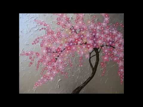
To create this painting, I was inspired by another painting of a cherry blossom tree. Both my painting and the painting that inspired me have a textured background and include many flowers. I wanted my painting to be different from this one, so instead of using brown for the branches of the tree, I used black. Also, instead of using pink for the flowers, I used red.
Today, people believe that in order to fit in with the rest of society, they need to be just like everyone else. They need to wear the same thing, have the same body and facial features, and act the same. However, people need to realize that they are their own person. It is good to be different from other people. Accept who you are because everyone was created the way they were, for a reason.
-Yours Truly


No comments:
Post a Comment